Theme values instead of repeated styling
Semantic CSS variables let a product change colors, spacing, and typography without rewriting the components. Shared primitives make the interface more consistent as the product grows.
GUS UI · Built by Gus Vega
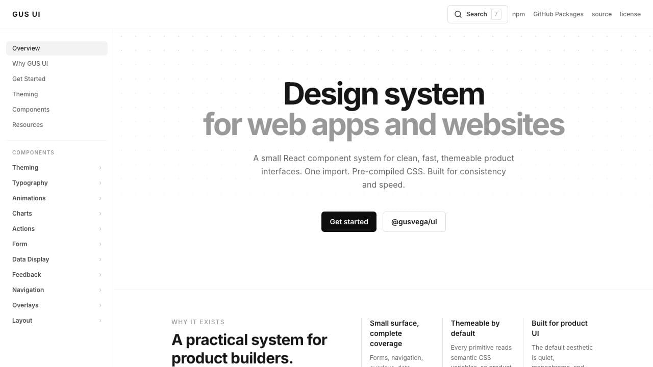
A React component library for building cohesive product interfaces, with reusable components, theme values, and working documentation.
My role
I built the component library, theme system, and documentation experience to give my products a shared visual and interaction foundation. Components ship with TypeScript declarations and compiled CSS in the public @gusvega/ui package.
Semantic CSS variables let a product change colors, spacing, and typography without rewriting the components. Shared primitives make the interface more consistent as the product grows.
The documentation pairs rendered components with usage code, props, and interaction guidance. It gives a developer a working reference when choosing and integrating a component.
Version 1.0.0 is published on npm under an MIT license, with a GitHub Packages mirror and public source. Explore the interactive documentation or install the package to use it in a React application.